
In this article
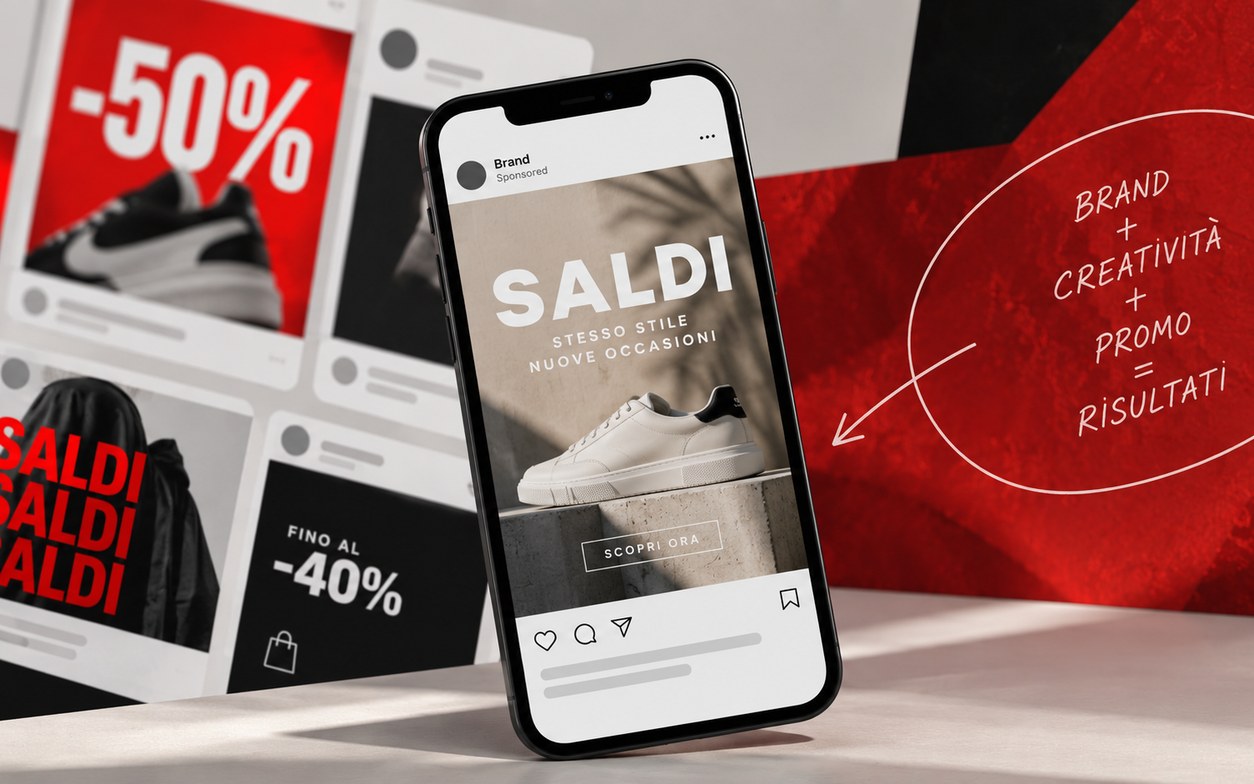
During promotional periods the feed tends to fill up with the same elements: big percentages, red, bold fonts, urgent messages and offers placed at the center of the creative.
That is not necessarily wrong. The problem arises when the promo becomes so standardized that it makes a brand indistinguishable from the others.
A good sale creative has to make it clear right away that there is an economic advantage, but it should not stop there. Instead of just showing a percentage, you need to shift the focus to what that promo allows the person to do.
During a sale, saying "discount" is not enough
"Sale", "-40%", "today only": these are very clear messages. But they are also messages any competitor can use at the same moment.
The difference lies in the next step: explaining, implicitly or explicitly, what that discount means for the person seeing the ad. It can be the chance to finally try a premium product at a more accessible price. It can make something affordable that until yesterday seemed out of budget. Or it can simply give the person the reason they were waiting for to buy something they already wanted.
It is this shift from the percentage to the person that turns a promo from simple information into an occasion.
Communicating the discount
- "-40%"
- "Today only"
- "Sale"
- "Special price"
Communicating the occasion
- Finally trying something at a more accessible price
- Buying what used to seem out of budget
- Taking advantage of the moment for something already wanted
- Giving a concrete reason to act now
This does not mean hiding the offer. The percentage has to stay readable when needed. It means avoiding having it be the only idea in the creative.
Promotional creative has to keep looking like yours
There is no universal visual language for sales. A young, irreverent or streetwear brand can afford very aggressive communication. Huge headlines, strong colors, all caps and messages that almost shout can be perfectly consistent.
A premium or more elegant brand can instead use the promo in a much more controlled way, keeping room to breathe, order and a less aggressive hierarchy. The criterion is simple: it depends on who you are.
You can shout, if the brand already talks that way
Among the examples analyzed there is a creative built with a very strong headline, a high-impact palette, a centered layout and all-caps text.
It works within the analysis precisely because design and tone of voice go in the same direction.
The same approach, applied to a brand that normally communicates in a more restrained way, would risk looking forced.
High-impact communication
- Strong contrast
- Dominant headline
- All caps and direct message
- Strongly promotional language
More controlled communication
- More white space
- Less aggressive hierarchy
- Promo present without taking over everything
- Tone consistent with a more premium positioning
The point is not to always choose one of the two extremes, but to avoid having the promotion suddenly erase the language that makes the brand recognizable.
Four elements that should not be dropped
- Visual contrastHelps the message stand out quickly.
- Typographic hierarchyIt has to be clear what to read first and what comes after.
- Consistency with the brandA promo should not look like it was made by a different company.
- White spaceGives the message room to breathe and stops the urge to communicate urgency from turning everything into noise.
What pattern-breaking creatives teach
Analyzing promotional creatives is not about copying their layout, but about understanding which patterns keep repeating, which messages manage to be less predictable and how to bring these elements into a more intentional Paid Social strategy.
A hook can be promotional without being generic
The examples show very different approaches. One creative uses an aggressive headline. Another starts from the first person and a sentence that creates curiosity. Yet another does not talk directly about the product, but about the concrete consequences of not using it. Then there are irony, social promises and deliberately disorienting copy.
The lesson is not to always choose a creative or ironic tone. It is to remember that "-30%" does not necessarily have to be the hook as well. The way in can be the benefit, a consequence, a curiosity or something that makes the promo more personal.
The visual has to add meaning, not just decorate
One of the examples uses an authentic, unpolished shot showing the product, how it is used and its variants.
Another turns the message into a kind of receipt, making economic losses visually tangible. In yet another the image directly supports the promise made by the copy.
They are very different executions, but they share one thing: the visual is doing part of the work.
A useful question during design is therefore very simple: is the visual helping people understand the message or just filling space?
The promo does not always have to be the biggest element
In the examples we find both approaches.
In some creatives the offer clearly dominates the composition, as in the case of "UP TO 30% OFF" or "BUY 4 GET 4 FREE".
In others, the discount stays visible but leaves more room for the product, the benefit or the main promise.
This leads to four levers to check every time you build a promotional creative.
Framework: 4 levers to check
Hook
What should capture attention first?
Hierarchy
Which piece of information has to be understood immediately?
Visual
Is it reinforcing the message or adding noise?
Promo
Does it have to be the absolute protagonist or can it support a broader message?
There is no identical answer for all ads. The choice depends on the message and on how the brand normally communicates.
The mistakes that make a promo interchangeable
Originality can help you stand out at a time when many brands are saying practically the same thing.
But original does not mean strange, complicated or deliberately eccentric.
The most common mistakes are much simpler:
- generic claims;
- visuals and copy copied without adaptation;
- too much information in the same graphic;
- isolated percentages with no context;
- layouts inconsistent with the brand;
- message and image that do not work together.
To avoid
- "Crazy sale"
- "-50%" and nothing else
- Sale + new arrivals + restock all together
- A layout taken from other brands
- Copy and image disconnected
To look for
- One central message
- A reason beyond the number
- A clear hierarchy
- A recognizable voice
- Consistency between visual and message
The biggest risk is not creating an ugly creative, but creating one that could belong to anyone.
Before publishing a sale creative, check this
- Am I communicating only a percentage or an occasion too?
- Is the visual consistent with the copy?
- Does the message sound like it was written by my brand, or could anyone use it?
- Am I saying something different from the competitors?
- Does the visual really help people understand the message?
- Is there a single main message that is clearly readable?
- Is anything of the creative left beyond the price?
- Does the person understand what to do next?
During a sale you do not necessarily need to communicate louder. You need to communicate more intentionally.
The discount has to be clear, but it should not erase everything else. Tone of voice, visuals, hierarchy and message still determine how recognizable a creative is even when price becomes one of the main levers.